BBC News
2024 UK General Election
Leading the design of the BBC's on-screen and in-studio data graphics for live election results coverage.

As BBC News looks to update their method of graphics output (changing both hardware and software), this election was the 1st opportunity to test their new 'output direction'. Using a far more flexbile HTML based mode of delivery, I worked closely with BBC's Developers to deliver assets for this election coverage.


Despite this project being for broadcast, I still approached it as I would for any other digital project. Working in Figma allowed me to collaborate, share and deliver pixel perfect designs and specifications to the Engineering Team. With results potentially swaying in many directions, I had to ensure that every outcome and outlier was accounted for.


I dedicated the right side of the screen to incoming results and analysis, whilst allowing for live TV to continue on the left side.


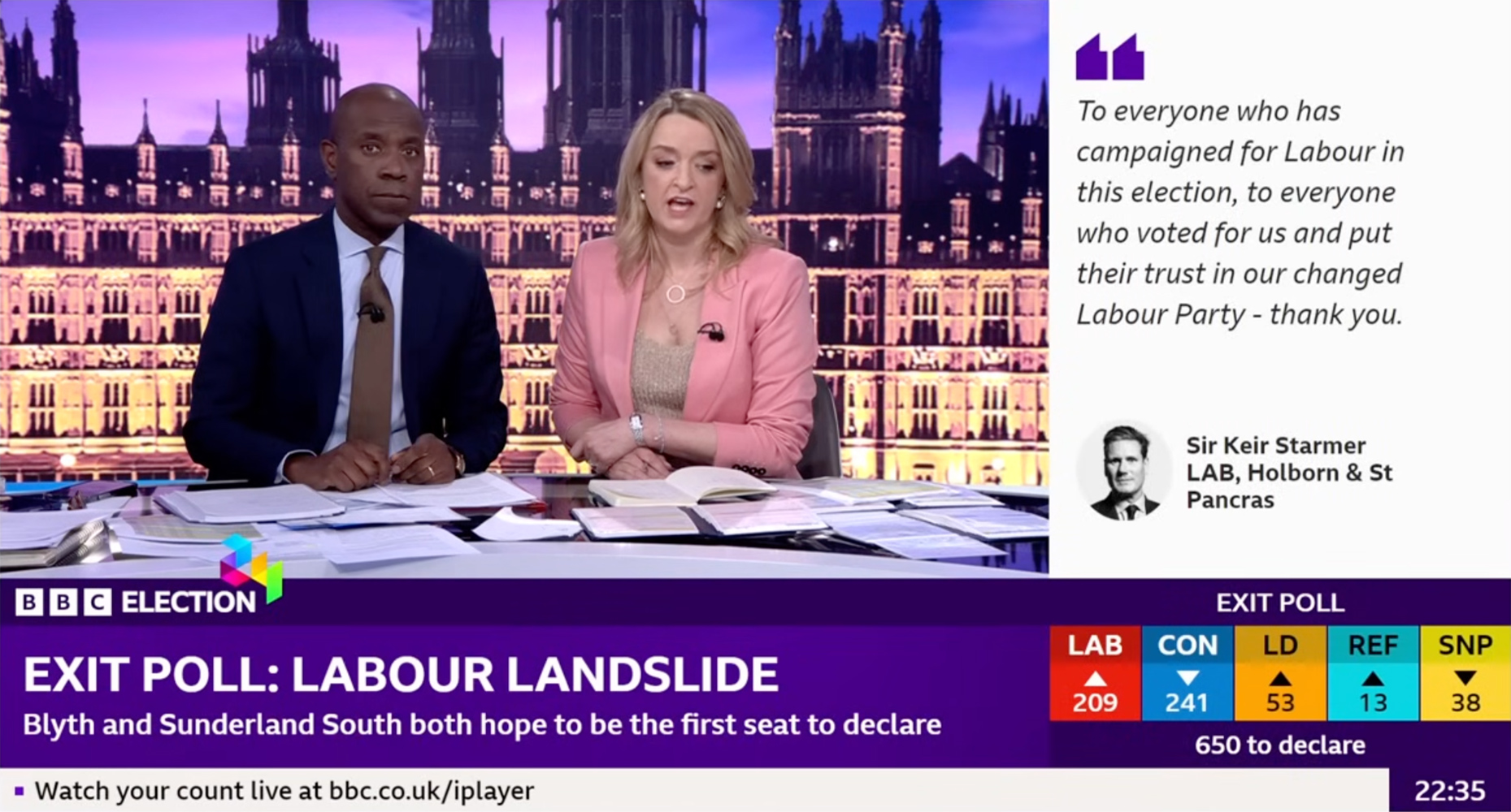

The 'tower' screen behind the presenters served as information for both the viewer and presenters - with party order shifting position inline with the incoming results.


We also made use of the extra-wide 'catwalk' screen, with a plethora of dynamic graphic results templates, enabling the presenter to easily read and explain both the exit poll predictions and incoming live results throughout the evening.


Here is BBC News' Rita Chakrabati talking through some of the in-studio results data on the catwalk screen.


Moving onto the 2nd in-studio Tower, this was used as a more graphical backdrop.

There were moments before the event where we could test out the graphical treatments, allowing us to check for position, legibility and general coherency. This also allowed for senior BBC directors to view, comment and sign-off on the work. And yes - that's me on the presenter's chair!

